Visual identity in your brand guide: The right way to stay on-brand always
Last week, Morten wrote about the way a brand guide can become a roadmap for your entire communications ecosystem and how important it is to get the structure in it nailed. This time, I am going to take you through some of the basics regarding the visual side of things in your brand guide – what is need-to-have, and what is nice-to-have.
Your visual identity guidelines can be as flexible or strict as you would like them to be. BUT – usually, the larger company you have, and the more people are “out there” representing your brand, the better it is to have some rules set in place. Whether you are printing brand new business cards for the next tradeshow, putting together a shiny new sales-pitch or running your TikTok account – consistency, not only in what you say, but also how you appear, is the key. Because staying visually consistent means building a strong and recognisable brand.
Here are a few first steps you can take to build visual design guidelines and make sure your brand stays visually consistent:
Logotype
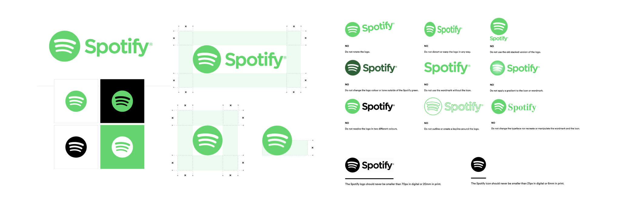
Logotype is your most recognisable design element. That’s why it’s especially important to make sure it’s always clear, legible, and recognisable. When setting guidelines for best practices, consider:
- Scalability
- Is your logotype still clear when scaled down?
- If the logotype contains tiny details – should it have a simplified secondary version?
- If you are creating several versions of the logotype, remember to include all intends and purposes in your visual identity guidelines. (With illustrations / visual examples)
- Adaptability to black and white
- If your logo is colourful, it’s always a good idea to create black and white versions for use on different colour backgrounds.
- If the logotype includes any sort of graphic (icon or illustration), don’t just recolour the logo – always test your negative design – does it still have the same effect? If not – it’s always ok to make small alterations to the design, to make sure it still visually represents the same story.
- Spacing and size
- How much air/ empty space the logotype should always have (at least) – to make sure the logotype stands out and isn’t cramped in between other content.
- What’s the suggested minimum and maximum size for each logotype version?
- And finally – what not to do.
Don’t want your logotype recoloured in random colours? Squished, stretched, flipped, angled? Don’t like gradients, shadows, or weird outlines? Add that to the guidelines. Even better – it with a visual example.
Colour palette
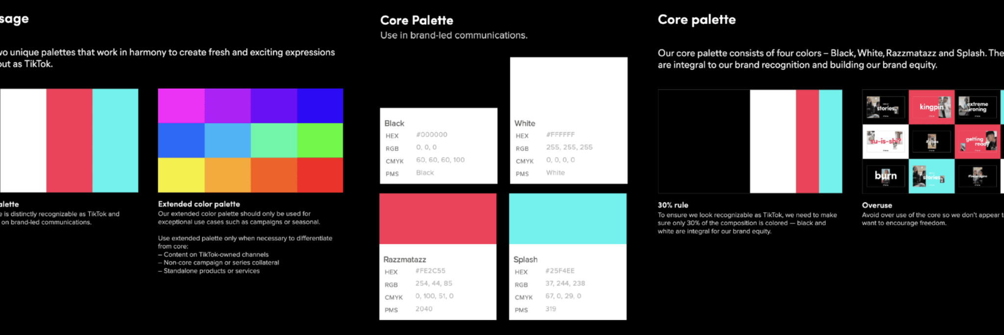
You have chosen a beautiful colour palette that clearly resembles with your brand story and underlines your business-personality. Here’s what you should include in your visual design guidelines, to make sure it remains that way:
- Primary colours – specify the colours that should be the most used and associated with your brand.
- Secondary colours – pick a set of colours that may be used to compliment the primary colours. These are often used for accents or backgrounds.
- Include colour codes for accurate reproduction. (RGB and Hexadecimal for Digital use, CMYK and Pantone for Print)
- To make sure that your selected accent colour doesn’t suddenly end up running the show in a presentation deck, because someone just thought that every single slide in bright green is so much more fresh.. Add a chapter on Colour hierarchy and explain how the colours may be used in relation to each other. Some colours might be more important to include, whereas fx. some of the accent colours should only be used for Call-to-action elements.
- Consider colour pairing – which colours work great together? Are there other shades that should never be placed side by side?
Typography
The way you use fonts can become a part of your brand aesthetic:
- Do your selected fonts have versions in black, bold, light, thin, half-transparent…? Decide -what variations of the fonts you are going to use and when.
- Define your H1’s and H2’s- decide what font sizes (weight and colours) you will use for different content types (How does your headlines look? How much larger do they appear in relation to paragraph text? How will you style any special types of content – fx. A customer quote or a CTA? )
- Consider spacing and alignment for all content types. Decide how big is the paragraph line height? How much spacing there should be after headlines? etc.
- Choose a substitute font. There can be situations, where your chosen typeface is not available (fx. your email signature) pick a similar system font as a fall-back option. In your design guidelines describe situations where the more generic typography can be used as a substitute font.
Visuals
Photos, illustrations, icons are a huge part of how your brand can communicate visually. I know – duuhh… But that also means there must be some decisions made about what kind of visuals represent your brand best:
- What type of images you use? What motives/topics should you choose? Is there a specific atmosphere or colour scheme you prefer? (Fx. Are you going for cool-toned, light corporate aesthetic or are you more dynamic composition, people – in – motion and explosion of colours type of vibe?) Create a mood board with examples – it can not only be a useful when creating a royalty free image library, but also become a helpful reference for any corporate photoshoot planning.
- What type of icons are you going to use? Pick an icon style and stick to it. There is nothing messier than materials full of icons and illustrations in all shapes and forms. Design (or buy) a few similar looking icon packs and use them consistently across all your materials – print and digital.
- Decide – are you using illustrations? If yes – when should you choose illustration over icon or photo? Again – choose a style and stay consistent.
- Supporting graphic elements– designed to be visually distinctive, memorable, and closely aligned with the brand’s identity. Whether it’s a pattern, brand-mark or so called “5th element”, make sure to add examples for best practice to your brand guide.
All rules set in place. Now what?
Presenting your team with a shiny new rulebook and just playing brand police will not do the trick. People are different and can interpret guidelines in a different way, forget to use them or decide to cut a corner when time is pressing.
Help your team help you and give them a starting point – a few simple, but thought through templates, that they can whip out any time a new SoMe post has to go live, or a slide has to be added to a presentation.
Here’s what you can begin with:
- Template for Presentation slides (Cover slide, Agenda slide, 2-3 Content slides, a speaker slide & final slide )
- Template for Word documents
- Templates for Social Media pages (Company page banners, personal page banner, posts)
- Template for a Business card
- Template for your email signature
Nice-to have’s:
- Templates/Examples for advertising materials (Flyers, brochures, etc.)
- Template for video content
- Templates/Examples for Event merchandise (Suggestions for branded merchandise, design examples for Rollup banners, Exhibition stands. etc.)
Lastly – make sure the templates are easily accessible to your team and they always know where to look for guidelines (logos, images, icons – all that good stuff ) if ever in doubt.
Have fun 😊
Reach out
Want to know how we can create a design that tells your true story?

Dite Cepule
Digital designer, animator


